Thinking about how you want your logo to look can draw a blank. Your business may be as a tradesman or might be a retail outlet or any other type of business for that matter. Many business owners feel that they don't have a creative bone in their body. That's not unusual at all. To get some great ideas for your logo design can be quite simple if you know what to look for.
Here are a few things to look at that will guide your thought process and allow you to come up with some great logo design ideas for yourself. We will take it one stage at a time.
1. Colour
a) Moods and Feeling
Do you have a colour scheme already or in your mind that you are happy with? Does that colour scheme work well or do the colours clash? Do you even know?
Colour science is the study of colours and the impact they can have on our everyday lives. Colours can drive our emotions positively and negatively. You don't want your logo give people a negative feeling about your business so it's important to understand at least the basics.
Here is a link to a US university site that I found that explains in very simple terms what colours can do to our mood. Bloomberg University Colour Info
Another link here picks out some more moods and feelings associated with common colours. The meaning of colours
b) Balance
Once you have selected your colours you need to know if they work together. It's important that your logo is not an eyesore but something that looks as if it is well balanced. A good choice of colours will make your logo appear stronger and help to give it meaning. Ideas will begin to flow about how you want your logo to look once you are happy with your choice of colours.
Many designers cheat when it comes to selecting colours that work well together. I use the word cheat a bit "tongue in cheek". They use tools like colour wheels and colour matching charts and swatches. You too can learn from the professionals by using similar tools that are meant for the pro's.
Colour wheels are great for selecting complimentary colours in graphic design but you can also use them for selecting colours that work well in your house. This tool is one that can be used for free. It is a free colour wheel that will aid you in putting together ideas for your logo design. Free colour wheel.
2. Text Font
Do not underestimate the power of a good font in a logo design. If you choose well you can solve one of the biggest problems in logo design. The selection of a great font. Some fonts work better in certain situations and for different purposes. Let me give you a very clear example of what I mean. Let's say you have a high-tech electronics company and your logo design idea is to have an image of an electrical circuit with the words High-Tech Electrical Co next to it. Have you got the mental image so far?
The font you imagine next to the image of the circuit would not be whimsical in appearance or cartoon like. Those font styles will never work with a high-tech image. So already, you can see in your mind how important the choice of font is to make your logo idea come to life and have credibility. The electronics company will have a modern "san serif " font that has a high-tech feel to it.
Designers spend years studying fonts and working with them to convey emotion and feeling for given situations. The good news is that there are tools available to help you choose a particular font for a specific need. Using font tools can help to develop further your logo design idea.
Adobe, one of the leading font and font tool companies in the world have a very easy to use tool on their website that makes it simple to select a font that should work well with your logo idea. You can find this great logo design tool here: Free font tool
3. Style
Most logo designs fall into three different categories. Text based logo, Iconic or Emblem and Illustrative. These three logo design styles can be considered for most companies and the choice can often depend on your personal preference. Each one of these styles does have pros and cons associated with it though so lets take a quick look at what they are.
a) Text based logo design
Text based logo designs are usually preferred by large companies. Companies that have already built a brand or that have so much marketing spend behind the brand that the logo itself does not need to have any specific meanings or symbolism. Take for instance the Microsoft logo or the Nike logo (text, not tick, although either can be used). IBM have a text based logo too as do hundreds of other companies found in the FT 500 companies list.
Small to medium sized companies, although tempting to make themselves look much bigger find it hard to pull off a text based logo due to the marketing spend required to make the brand memorable. In small niches this may work better.
Pros:Can make your company look bigger in a small niche. Low cost to brand due to the simple nature of design and application of the logo across different media and applications.Logo does not follow fads and fashions which means it can have greater longevity.
Cons:Hard to make it work for small to medium sized companies without having a large marketing budget.Can look pretentious if used by small to medium sized companies.Does not portray a businesses personality well unless backed up by a large advertising spend.
b) Iconic/Emblem Style Logo
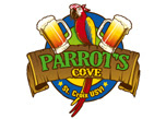
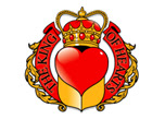
This is the preferred design style of modern and old businesses alike. Favoured by new businesses and those looking to update their existing logo design. Often used by larger companies too. This style of logo design is the most popular and has been since logo design came of age back in ancient Egypt thousands of years ago. The emblem or icon can be abstract or explicit to portray a companys' personality. The emblem or icon is used to show the viewer what the company stands for. It may well indicate the type of industry or be more personal like a set of initials.
Used in conjunction with a well chosen font and powerful colour scheme the emblem/iconic logo can ooze professionalism. The emblem or icon can be placed in various positions in relation to the text. Popular positions of the icon/emblem are to the left or above the text. Not so popular are the icon/emblem placed to the right of the text.
The icon/emblem can be separated from the text too so it can be used on it's own as a symbol of the business.
Pros:Easy to brand across different media and applications.Relatively low cost applying the brand.Works well for most types of business.The emblem/icon can be used on it's own or with text in marketing materials.Easy to portray personality with a well designed icon/emblem.Can have a long life time.Easy to remember.
Cons:Can be based on fads and fashions. Take for instance the swoosh or the ball designs favoured in the 90s. These now look very dated.Can be too abstract and give the wrong impression.A high level of skill is required in matching an icon/emblem to a suitable font.Often require more than 2 colours which increases printing costs.
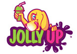
c) Illustration Logo Design
This design style looks the most value for money when viewed for the first time because it has a massive WOW factor. This style works well for consumer goods and food stuffs because it is easy to paint a picture with an illustration. These designs do not need to be clever or subtle because they are designed to be to the point.
Pros:Massive initial WOW factor.To the point and descriptive.
Cons:Expensive to brand if gradients and shadows used in the design.Usually more than 3 colors so printing is expensive.Not easy for the viewer to remember due to complexity of design.Hard to brand because of complexity of design.Short lifespan of design if illustrating products.
4. Tag line/Strap line
Many companies have a strapline that adds a company message or marketing statement or lists a service. It is not compulsory to have one and is a matter of personal choice. Some companies have a logo design idea to use 2 logos. The same logo actually but one with and one without the strap line.
Here is an example of what I mean. Let us say that you are a logo design company. Your logo design firm has a logo that is iconic with text next to it. Under your business logo text you have a strap line. Here are some things you could say for your strap line. Low cost logo design, or what about Logo Design : Brochure Design : Stationery Design. You could even say "The Corporate Identity Experts". So you see, there are different ways of doing it but each way has it's merits.
When you are thinking about ideas for your logo why not try some different things for your tag line. Try listing services. Try a marketing message and try a unique selling point that you want to be known for. Once you have a few different ones worked out, run them past your friends and family.
Things to watch out for when coming up with a strap line:
Keep the number of words down to a minimum. The fewer the better. If it turns into a sentence. Try again.Make sure that the text you are using is not in breach of someone's trademark.
You may need to seek legal advice here but if your words are common, everyday words, then you should be OK no matter what you use. If in doubt check with a solicitor. If it sounds familiar, you may have subconsciously heard it before. In that case, you should definitely check to make sure this is not trademarked.
Author: Simon McArdle
www.logoquality.com
The Corporate Identity Experts
Friday, 30 November 2007
Logo Design Ideas
Subscribe to:
Posts (Atom)