Here are your top 10 tips covering design style, layout, colour and font to help you in specifying your logo design:
Logo’s tend to fall into three different design styles. Before you do anything else you should choose the style of your logo. It is important to do this early on because the style of logo you select will influence nearly all of the other decisions you need to make.
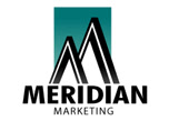
1) Text Style Logo Design
The text based logo design is the favoured design style of the big company. This logo design style looks very easy to design to the untrained eye but usually contains several skillful design techniques.
The text based logo normally contains very few colours and rarely uses graphic effects like drop shadows and camera flares.
Because the design is usually simple in appearance and often contains few colours, it is easy to use across many different mediums. It will translate well from office stationery to brochures to TV. This means that the costs involved in building the brand up are kept to a minimum because the logo does not require to be supplied in many different forms.
The text based logo design style is not suitable for all businesses. It does work well in small professional niches like legal services or high tech businesses like software companies. Generally speaking though the text based logo is best left to the big boys. It is much more expensive to take a text based logo design and turn it into a brand like Microsoft or IBM or Compaq.
Here are a few examples of text based logo designs that http://www.logoquality.com/ has designed for customers recently.


These logos have one thing in common and that is the font used for the basis of the design has been modified by the designer.
Although these logos look simple in design it is not a simple skill to pull off successfully.
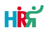
The key to these logos working well is that even though they are simple they do carry a message. In the case of the HRR logo you will not be surprised to hear that this is a human resources company. The R's have been design to look like people in a simple abstract kind of way. The Atta Clean logo spells out what it does but also has a cleaning brush making up part of the sweep in the C in Clean. The sweep has a sweep so to speak.
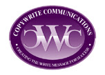
2) Icon Style Logo
The icon based logo design is very popular with both large and small businesses. The icon itself can be abstract, letters making up the company initials or an image that has some symbolic meaning for the company.
The way the iconic logo design is presented can vary. For instance, the icon can be placed to the left of the text, on top of the text, to the right of the text or even below.
As the preferred logo design style for the majority of businesses, it is easy to see why this style has such a great following. It is far easier to brand a company using an icon style logo design compared with a text based logo design. Visually it is easier to remember the icon that represents the business.
From a design perspective it can look like the logo is very simple to design but there are often subtleties’ that are not instantly obvious to the untrained eye. Designers often hear it said that “anyone could have designed that logo”. Or, “I could have done that myself”. It is only when the subtleties’ are pointed out to the customer that the full value of the design is realised.
Here are a few Iconic style logo designs that were created for clients by http://www.logoquality.com/


The layout of these examples differs in the placing of the icon in relation to the text. The icons themselves also range from abstract through to obvious. Simplicity is key to making these designs work so well.
The font choice for these companies is very important too. The font must work on 2 fronts. First it must compliment the icon and second it must be the correct style of font for the business it is representing. Take the Care Assist logo above. This logo would not work if the font selected was high tech in style like that used for Solaris.
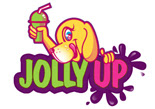
3) Illustration Style Logo Design
The great thing about this logo design style is that it always looks really impressive. Illustration is a specific skill within graphic design and is only ever mastered by a few graphic designers. To do this well takes a lot of creativity, as well as mastery of design tools.
The illustrative logo design style will often cost more as the work involved in creating the logo design is usually significantly longer than for producing say an iconic logo or a text based logo. I am talking about the actual job of doing here rather than the processes that gets you to the job of doing. The processes regardless of design style are the same.
These types of logo design work best for Product logos, consumables and the food and drink industry. It is easy to paint a picture of something in the mind if it is laid out in glorious illustration.
The biggest problem with this design style is that it generally costs a lot more money to turn an illustration into a recognised brand. Because the design is often complex, various different logos need to be produced so that the design can work across different media. Printing can really start to add to the cost of marketing too.
Here are a few Illustrations designed by http://www.logoquality.com/ that will give you an idea of the skill required in designing in this style.


4) Layout of Design
There are different layouts to consider for the design style you choose. Text based logos for instance, usually have the name of the business on one single line. However, this is not a hard and fast rule and some designs can be presented with the text on different lines. If the name is very long this might prove to be a better option visually. It might even be better to just use the initials of the business if the name is particularly long. Take the HRR logo above for instance where just the initials are used.
Icon/emblem styled designs can be designed in several different ways. The obvious ones are with the text to the right of the icon or the icon above the text. Two other ways to present the logo are with the icon to right of the text or even with the icon incorporated in the text. See what I mean here with these icon/emblem examples designed for customers recently by http://www.logoquality.com/


The layout of Illustrative logo’s usually follows a roundish or square shape. These shape just seems to work well for this design style. Of course the design can be other shapes too but the majority seem to fit the round or oval and square shape really well. Take a look at these designs here and see what I mean.


5) Colour
Colour is a very powerful visual medium. It can make us feel positive or negative. It can portray confidence and no confidence, anger and happiness, calm and stormy. The choice of colour or colours used in your logo must portray the correct message for your brand.
A gym that is aimed at young affluent men in their 20s would not do well to select a logo made up of mainly pinks. A flower shop would not normally have their corporate colour as blue. A financial advice business would rarely want to choose red for it’s design. These are pretty obvious cases but you would be surprised at some of the colour choices we get asked for.
There are many fine resources that can help you select an appropriate colour scheme for your business. It is important that the colours you select not only portray the correct mood but also that they work in harmony together. Clashing colours do not generally give the type of message you want your customers to see.
http://en.wikipedia.org/wiki/Color_psychology (Colour Psychology)
http://www.sessions.edu/career_center/design_tools/color_calculator/index.asp (Colour Wheel)
6) Font
Choosing a font for your logo design might not seem like such a big deal but it is the most important part of your logo. If you get the font wrong it does not matter what style you choose or colour scheme you select, the logo will be a failure. Get the font right and it could help to bail out a weaker part of the design. The type used is the cement holding together everything else in your design.
If you have a poor icon a well selected font can make the logo acceptable. On the other hand if you have a poor choice of font it is unlikely that your logo will succeed.
Designers spend years training in using the right font for a given situation. It is not something that you can generally just pick up like being a good chooser of colours. If the font is a common everyday font then the impact of the design is likely to be less.
To give you a head start and to borrow from the knowledge of experts in font selection you can use a font choice tool. Adobe who are one of the leading providers of fonts and graphic design programs provide a great tool that can be used as a guide in selecting a great font to be used in your logo design.
7) Design Brief
When you have collected together all the practical things like design style, colour, layout and font it is time to write down some information about your business and what it stands for. Your customers, your marketing messages, your business ambitions.
You need to put together a design brief so that your designer can get a better understanding about you and your business. It is this information that will guide the designer in the direction you want to go. The more information you let the designer have the closer they can get to your expectations.
Most online logo design companies like http://www.logoquality.com/ have a simple order form that you can fill out in conjunction with speaking to a designer in person if you wish. The logo order form is structured so as to ease from you the required information, allowing you to give as much or as little information as you feel comfortable with. This part is important because if you give the designer very little to go on it is unlikely that the designer will be able to hit the mark first time around.
8) Designer
Make sure you are confident that the designer is up to the task. There is nothing more frustrating for a customer to get into an endless revision round cycle because the designer is not capable of understanding the brief or not skillful enough to pull it off. All designers are not created equal.
Many “so called” designers are self taught. These are usually the ones that hang around forums or sell their services on ebay and freelance websites. These are the ones you need to be careful of. Not just because you may have an endless task designing the logo but you also might leave yourself open to prosecution should you be palmed a logo of suspect origin. Like for instance a copy or near copy of someone else’s design. It happens and it happens a lot.
Always choose a designer that works for a real registered company with a real VAT number. This ensures that if things go wrong you can report the company to Trading Standards or have someone to take to court if you are sold a lemon. Telling the judge you didn’t realize the design was a rip-off will not be sufficient in most cases to allow you to get away from being fined a substantial sum for trademark theft or passing off.
Try and choose a graphic design firm like Graphic Design Ltd http://www.logoquality.com/ that employs designers with a formal design education. This means that they have the correct foundation to design from and ensures that mistakes with colour, file formats and print output are few and far between. Just because a design looks great does not mean to say it is designed correctly and can be used across multiple media and applications. A design education is a very important thing to look for in your choice of designer if you want to avoid unnecessary frustrations down the track.
9) Budget
This is the strangest thing in commercial graphic design and can be the cause of many frustrations for customers. Graphic design services seem to take on this unquantifiable pricing structure that leads to much confusion that makes it hard for people to have confidence in whether or not they are getting good value for money. How much should you pay for a logo design? The answer is what are you prepared to pay.
Take for instance the branding campaign for something like the 2012 London Games. The government paid out a staggering half a million quid for the design and branding campaign. They seemed to be very happy with the price.
Private businesses seem to be more conscious of value than public sector businesses. That is why companies like Graphic Design Ltd have fixed price services. Fixed prices mean that the customer knows what they are going to pay out and can set a correct budget for the business. Working with a designer that charges by the hour can bring in a lot of uncertainty. If the designer makes any mistakes along the way, it is the customer that pays for those errors.
Set your budget for logo design and stick to it. For the logo on it’s own you can use an expert logo design company like http://www.logoquality.com/ for just £149 (ex VAT) with no hidden charges added on. There is no need to pay more than this.
10) Delivery
When do you need your logo for? Some design companies can take an age just to put together a few rough drafts. If you have a marketing campaign starting anytime soon you may well miss your deadlines unless you can agree on a timescale from start to finish of your project.
Select a logo design business that is upfront about delivery times. For instance, choose a design studio that promises to send your initial logo design ideas in three business days. A design firm that sends back alterations to the design in two business days. This way you are in control of the timescale in which your logo design project completes. You can then schedule marketing campaigns and branding promotions with a much higher degree of accuracy.
Author: Simon McArdle
Director
Graphic Design Ltd
01753 20 80 22


No comments:
Post a Comment